Featured Image Credit: Apple Hub / X
Apple's major design overhaul has been slammed by iPhone fans as an 'abomination.'
At WWDC 2025, the tech giant showed off what's to come in iOS 26 this fall. While the Apple community didn't get the much-hyped iPhone 17 unveiling many were hoping for, the company did show off plenty of new features that got people talking online.
The iPhone software update brings some genuinely useful additions like Google's Call Assist and Call Screening, redesigned core apps, and the long-requested battery charging notification feature.
But there's one particular change that has iPhone users absolutely fuming.
Advert
every day we stray farther off steve’s light.. #ios26 pic.twitter.com/NrfdCXiPt3
— Mert Erdir (@merterdir) June 10, 2025
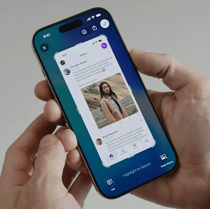
Apple's biggest visual change in iOS 26 is its 'Liquid Glass' operating system - a translucent design overhaul that represents the company's first major interface transformation in a decade. The iOS 26 update gives app icons, buttons, menus, and pop-ups a frosted glass aesthetic, with blurred background colours showing through, as well as enlarged toggle buttons.
Inspired by the operating system running on Apple's Vision Pro headset, the glassy look will eventually roll out across Apple's entire device lineup, from Apple Watches to iPads. But, while it might look crisp at first glance, Liquid Glass is telling a different story among its users.
Reportedly, the design severely reduces readability in several key areas, and users who've gotten their hands on the developer beta are not holding back their criticism.
Screenshots shared across social media show the practical problems with this design philosophy. Text overlays in apps like Spotify, Apple Music playlists and Lock Screen notifications have become genuinely difficult to read due to the increased transparency.
What a mess. #iOS26 #WWDC25 pic.twitter.com/TlbiIixLHI
— Gary Meyer (@garymeyerca) June 9, 2025
"Every day we stray farther off steve’s light," one user posted on X, sharing a video of their widgets on against a translucent background and barely readable notifications.
Someone else on X called the overhaul a 'mess' whilst another iPhone user argued: "Nobody should be defending this abomination". Some users have gone as far as calling it the 'worst ever upgrade' with 'too much going on.'
Over on Reddit, one iPhone user claimed: "That's a disaster visually. The transparency is going to really drive away older people from iPhones. Too much going on and not enough contrast. The text on the notifications on the Lock Screen are the worst."
Fortunately, the internet community has come to the rescue with some practical solutions, though they're not perfect fixes.
One Reddit user suggested adjusting the transparency settings to improve readability. "If you want to increase readability, turn on Reduce Transparency under Settings > Accessibility > Display & Text Size," they shared.
However, this isn't exactly a magic bullet solution. While reducing transparency can help with readability in some areas, it apparently causes new problems with other app overlays and interface elements.
“It's hard to read some of it,” said Allan Yu, a product designer developing the workplace messaging app Output. “Mainly because I think they made it too transparent.”