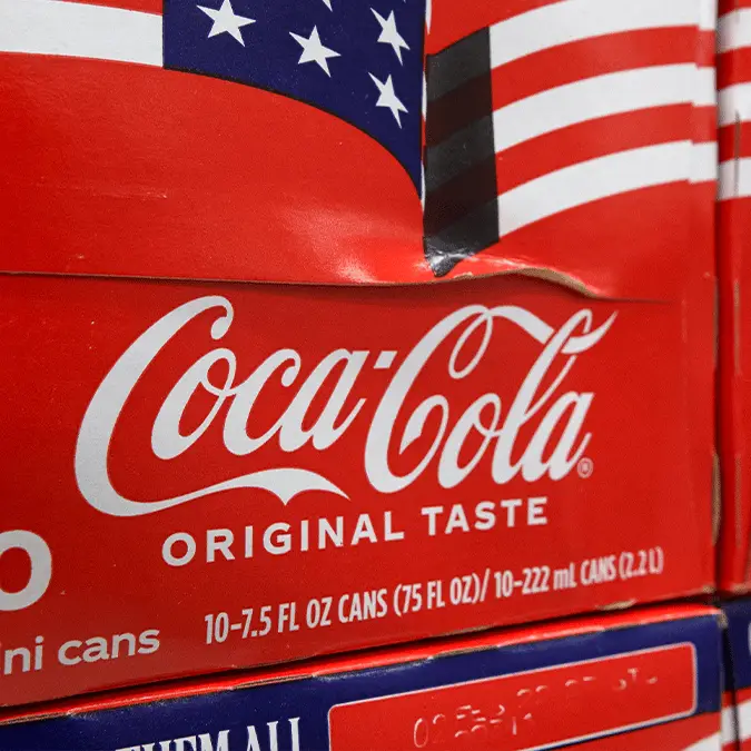
X users point out awkward detail about Coca-Cola's rebrand that 'only people over 40 will understand'


X users have spotted an awkward detail in Coca-Cola’s latest rebrand, and some claim it is something 'only people over 40' will immediately understand.
Some companies spend a fortune on tweaks barely anyone would notice, with Google reportedly paying a small fortune to subtly adjust its logo, while others go the whole way, as YouTube did when it quietly reworked its logo for the first time in years.
Coca-Cola's latest move sits somewhere in between, and it has landed the drinks giant with an awkward comparison. The company announced what it called a 'visual refresh' on Monday (20 July), complete with a slick 90-second video.
Behind the scenes, it is a full design overhaul by agency JKR, built around a familiar typography.
Advert
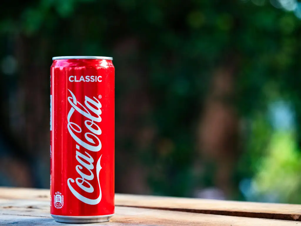
The new 'Better With' slogan uses a serif typeface created for Coca-Cola by Brody Associates in 2023 for a holiday campaign.
"We were asked to craft a new serif font family to express the brand's unique personality, movement, and playfulness," Brody associates said, as per Creative Bloq. "Inspired by the company’s archive, we blended Coca-Cola’s rich serif font heritage with modern-day requirements, adding another layer of storytelling to the brand through typography."
However, almost immediately, social media users clocked its resemblance to the typeface used by Marlboro.
While it's not identical, the likeness is hard to unsee, and plenty pointed out the irony of a sugary soft drink appearing to borrow cues from one of the most famously addictive products in the world.
Marlboro has been the world's best-selling cigarette brand for decades, which is not the company any soda wants to keep, given sugary drinks are hardly a picture of health themselves.
"Any person over 40 realizes that this is the Marlboro font. The people in charge of this are clearly under 40," one user posted on X in response to the new advert.
Others were convinced it was deliberate.
"Do you realise that its intentional? Cigarettes are bad, people want alternates, marlboro replaced by diet coke is what they want," one user asked.
"Bro, im under 40 and know this is marlboro font," another claimed.
"I thought it was on purpose," a third user claimed.
Some younger users tied it to the running joke of diet sodas as 'fridge cigs,' wondering whether that association was part of the plan all along.
"The younger generations been calling zero cal sodas “fridge cigs” for a minute so this actually makes sense," a fourth user stated.