Featured Image Credit: Google
Google recently made a change to its iconic logo, and they might have spent a fortune on it.
After 10 years of sticking with the same colourful 'G' we're all familiar with, Google shocked the tech world when it quietly made a very subtle change.
Once people started noticing the new logo, it led to a flood of opinions across social media, with some users calling it 'lazy' and 'doing gradients like if it’s 2008.'
The new look still has the familiar red, yellow, green, and blue colours, but instead of the blocky, separated sections, the colours now blend into a smooth gradient. It's not just the Alphabet-owned company known to make barely noticeable changes that create a frenzy. At the end of last year, Amazon confused its shoppers when it changed the colour of its packaging logo, while YouTube added a pink blush to its design, which caused a lot of hate.
But despite how small a change Google's redesign was, it might have cost the company a lot of money. People over on Reddit have estimated the total figure to be somewhere between thousands and millions.
Advert
"I'm sure some graphic designer walked away with millions to use the Smudge tool in Photoshop," wrote one user.
"I bet they paid a couple grand for that," claimed another, while someone else disagreed: "More like a couple mil".
This is all speculation, of course. We'll never know the real value unless the company officially releases the numbers. If history is anything to go by, it’s not unreasonable to think they dropped a serious chunk of change.
If we go back to 2008, Pepsi reportedly spent an astronomical $1 million to only slightly adjust the red and blue lines of their logo. Similarly, in 2022, the BBC’s rebranding cost the broadcaster a whopping £7 million, which happened to be during an 'eight-month freedom of information battle.' And British Petroleum's logo update allegedly cost a hefty £4.6 million, although the cost of the overall rebrand came in at jaw-dropping $211 million.
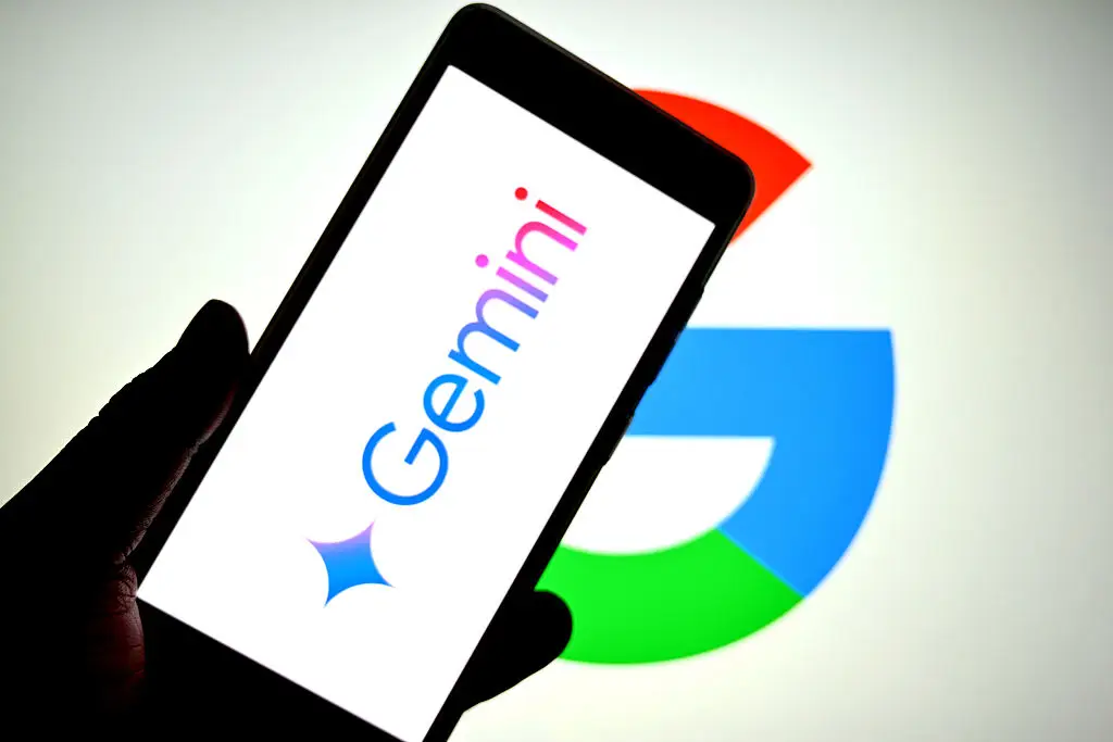
Going on these figures, we're probably safe to assume Google paid a good few million or more to implement a colour gradient. The company's aim was seemingly to align the logo with the aesthetic of its Gemini AI branding. So far, the change is only visible on the Google Search app for iOS, but it’s expected to roll out to Android and other apps soon. But it wouldn't be surprising if other Google logos and icons, like those on Gmail, Chrome or Maps, follow suit in the near future.