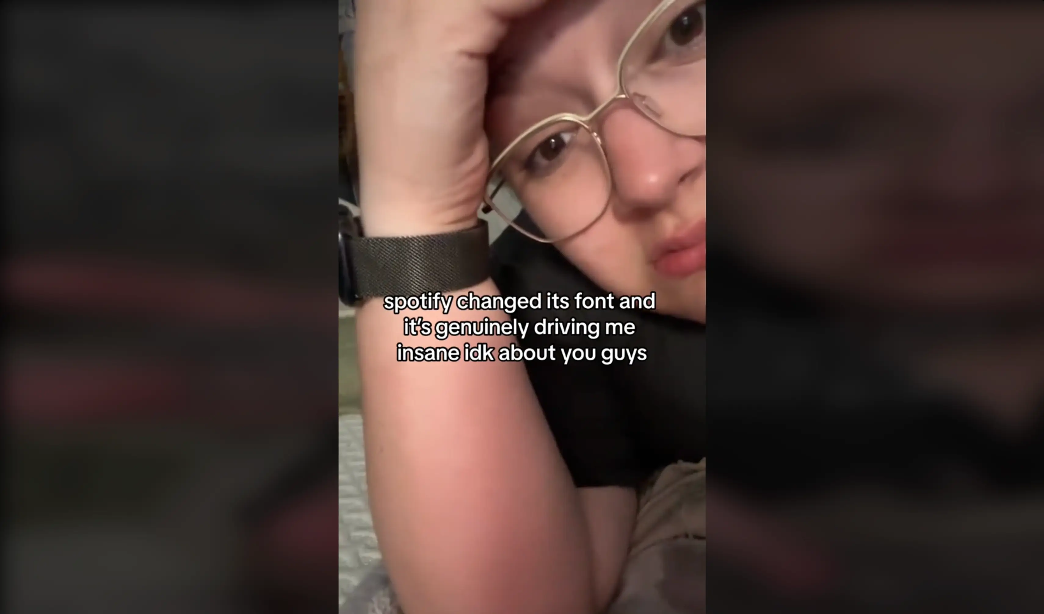


The small change to the music app has some people infuriated, with users saying that it’s ‘driving me mad’.
Spotify is known for their iconic green and black logo, which has remained unchanged since 2015.
But recently, the streaming platform made some tweaks that not everyone is happy with.
It seems that they thought people wouldn’t notice the difference but it has since spread across social media.
Advert
In one TikTok, a user posted a video captioned: “Spotify changed its font and it’s genuinely driving me insane idk about you guys.”
The clip uploaded by the page @carlylovesmusic went viral and with nearly 124,000 views, it’s certainly got people talking.
Users took to the comment section to share their thoughts, with one person replying: “Oh my god yes it’s driving me mad.”
A second said: “Real because why did they think they’d get that one past me and I wouldn’t notice.”
A third posted: “I thought I was just seeing things, it's been driving me crazy.”
And a fourth added: “Why did you have to point this out.”

The logo has been the same for the past nine years so it’s understandable why many are used to the way Spotify appears on their screen.
But the updated version uses a different font where the letters are slightly more spaced out. The logo also appears a little bit thinner than previously.
And it’s not just TikTok users that have noticed the change, it’s caught the attention of Reddit users too.
Under a video that compares the differences, the original poster wrote: “I made this video showing what's changed in the new Spotify logo VS the old Spotify logo.

“The waves in the circle icon DID change position slightly. Stick around until the end of the video for the icon comparison. And for the full logo, the circle icon next to the word mark is not as big now, a little bit smaller, and of course now has the new font to the right.”
It turns out that the change is very intentional, after Spotify announced it now has its very own font called Spotify Mix.
In a statement, the streaming platform said: “Spotify is as unique and personal as each listener who’s plugged in daily, as well as the artists and creators who have found a home on our platform. We never stop innovating when it comes to building an experience that reflects the vibrancy and creativity of our community.
“To that end, today we are introducing our new bespoke typeface: Spotify Mix. Spotify Mix replaces the current font used in our in-app and desktop experiences.”