Featured Image Credit: SOPA Images / Contributor / Getty / UniLad Tech
WhatsApp is used by tens of millions of people around the world, so when it makes a seemingly small change to its app, you best believe that people notice.
It's been making quite a few tweaks recently, too. It drew plenty of online ire in the last couple of weeks when it briefly changed the status words 'online' and 'typing' below a contact's name to have capital letters when they never had before.
That's been reverted, but a new change to the app's design on iPhone shows every sign of being a more permanent change.
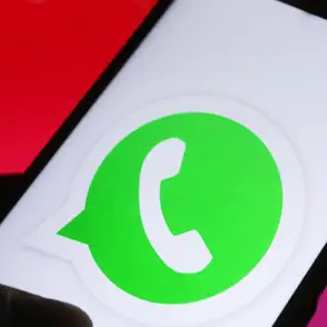
The app was updated this week to abandon the long-standing blue color scheme that it used for accents like notification bubbles and new message icons.
Advert
This blue had been in line with the blue chat bubbles that Apple uses on Messages, and felt quite distinctly "iPhone", but has just been changed to green, across all of those categories and even extending to URL links that people send in chats.
This obviously aligns much more closely with WhatsApp's logo, app icon and more, but it's still left people feeling pretty bereft as they look at their app.
After years of getting used to that blue, they've been venting on social media, with plenty of posts on X (formerly Twitter) showing people's sentiments.
One person wrote, "I've never seen an uglier shade of green than whatever is going on WhatsApp", which is a strong verdict for an innocuous enough color.
Another user appeared to be unable to almost believe the change, asking "So everyone’s WhatsApp has changed to green now then??? I don’t like it!!"
Some people had more precise annoyances about the design, though, like one who said, "That new green for WhatsApp is ugly, especially in dark mode!! Change back to Blue, please".
It's true that in dark mode the green stands out a little more than the blue used to, although whether that's enough to make WhatsApp reverse course is anyone's guess.
The reality, of course, is that this doesn't have any impact at all on how WhatsApp actually works on iPhone, or what it can do, so your day-to-day usage shouldn't change remotely.
That said, the intangibles of how an app makes you feel as you look at it are doubtless more important than we credit, so it's not ideal that people are so mad about a change that WhatsApp might have hoped was uncontroversial.
Still, having added some welcome features in the last couple of years, from the ability to share HD photos with your friends and family, and raising the limits on how many people can be in group chats, it'll hope that these useful options outweigh anyone's annoyance at a color-swap.