Featured Image Credit: Apple
There's always something that people complain about with every new iOS version, yet one particular feature that arrived with the recent update has caused quite the stir, forcing Apple to add the ability to roll it back.
If you listen to the iPhone community then you'll soon believe that every new iOS update is the worst it's ever been, and iOS 26 was certainly no different with a number of unpopular additions.
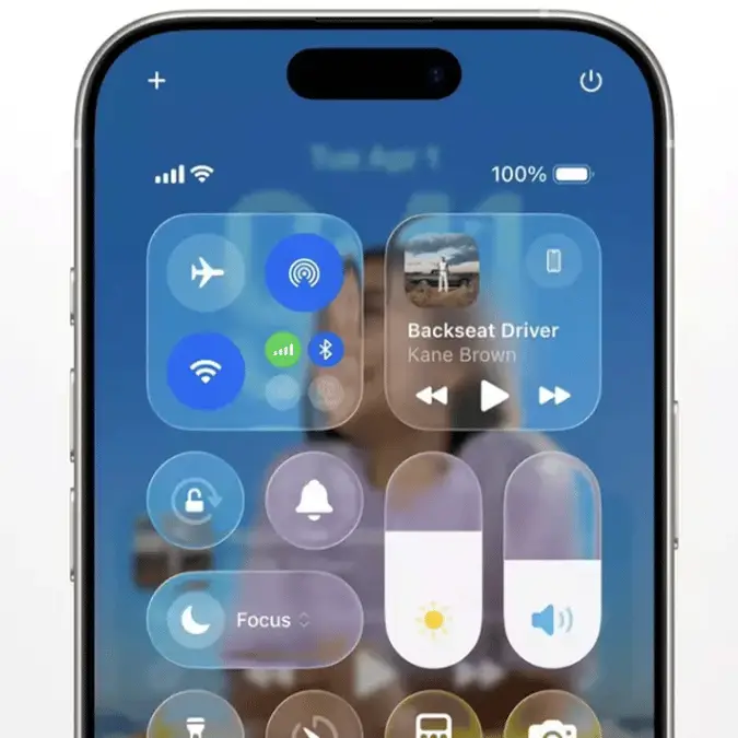
Chief among these, however, was the introduction of what many called the biggest visual overhaul that has been introduced by Apple in over a decade, as 'Liquid Glass' aimed to emulate the translucent feel of augmented reality headsets on a handheld device.
Some have admittedly been won over by the change, as it certainly adds a new feel to the experience of using an iPhone, but many were almost immediately against its introduction, and have looked for ways to go back to a previous version purely because of their distaste.
Advert
"After a few hours of navigating through my iPhone with the new Liquid Glass design, I must say that I am impressed to see that the wealthiest company in the world is able to ship such a piece of crap to customers," wrote one unhappy customer on Reddit just after iOS 26 released, and the general sentiment hasn't changed much since then.
People have pointed out their dislike for the new animations, the increased difficulty in reading some elements of the UI thanks to the transparent elements, and a general feeling that it's a major step back for a company that was once at the forefront of design innovation.
It seems like Apple has listened to the complaints though, as alongside the first major update for iOS 26 comes the ability to tune down some of the worst parts of Liquid Glass, so it might be one for you to try out if you're unhappy.
Notification Center with Liquid Glass Clear vs Tinted in iOS 26.1 Beta 4. pic.twitter.com/9rO1JbO5LW
— Beta Profiles (@BetaProfiles) October 20, 2025
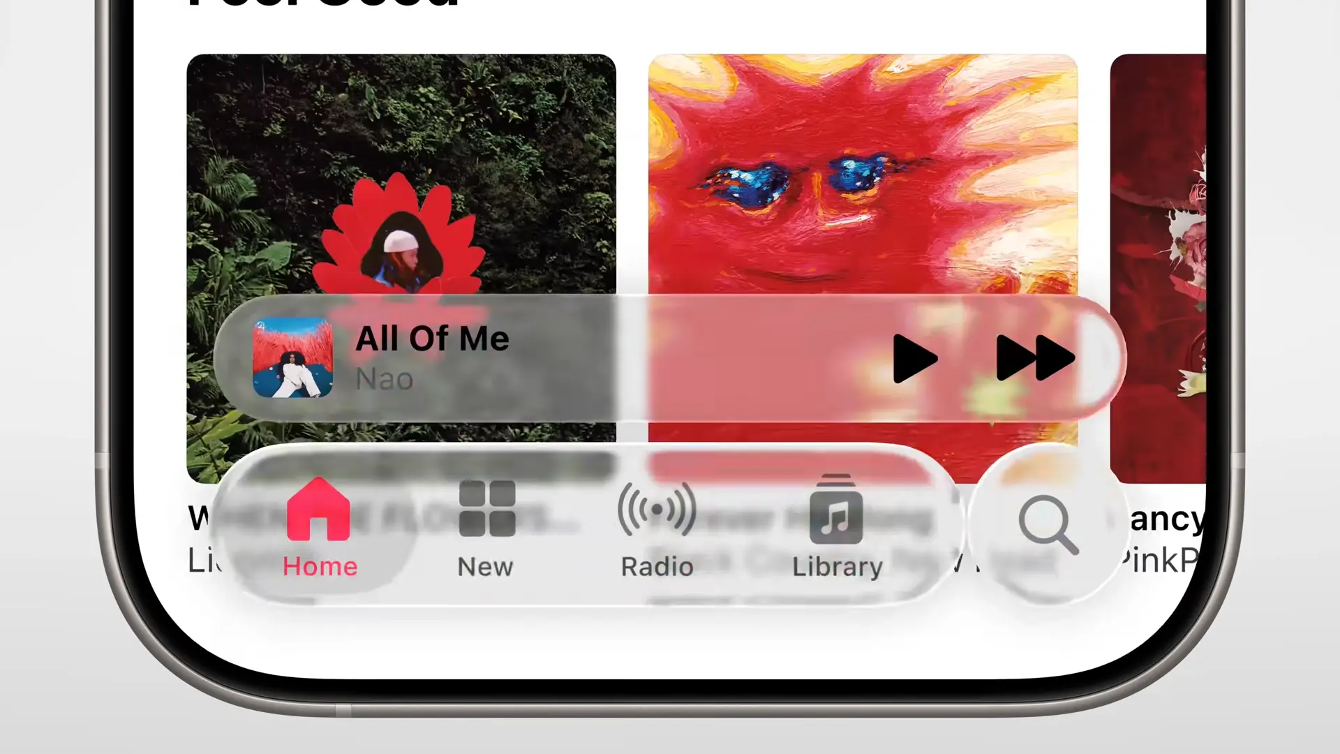
As reported by the Independent, iOS 26.1 introduces the ability to choose your 'preferred look for Liquid Glass', giving iPhone owners the option to choose between 'Clear' and 'Tinted' designs.
Clear keeps things as they were when the feature was first introduced, maintaining the heavily transparent elements that have upset so many, yet Tinted reduces the effect considerably, making it feel closer to what the UI was before.
The menu itself explains that "Clear is more transparent, revealing the content beneath," whereas "Tinted increases the opacity and adds more contrast."
While it still very much follows the design theme of iOS 26 overall, the difference is definitely noticeable and could save you from a headache every time you unlock your phone.
"FINALLY less ugly and more readable," writes one user on X in response to the change, with another adding that "Tinted looks so damn good, I LOVE it."
